Logo
I created a logo for my project specifically for a product we came out with, compared to professional logos my logo is really simplistic but works for my product and overall idea for example some Esport logos are much detailed and have a lot of work put in them I also wanted to have that but unfortunately it didn't work.
My logo is suitable for young children all the way to adults because for the children they like dragons and fantasy but for the adults is mostly about bringing up memories of them playing the old Monster Hunter games, yes my logo is based on the Monster Hunter series.
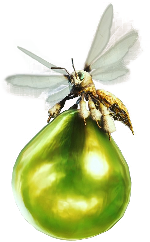
For the creation of my logo I used Illustrator and for the detailed description of the tools that I used, first of all I used the Rectangle Tool to get the tail shape and made it thinner and longer so It can have a pretty close shape of a tail after that I used another rectangle to make the tip of the tail the Shaper Tool helped me to have a pointy end for my tail. After the tail shape I used two more rectangles to form the spine that connects the tail and the body specifically one to connect the bottom part and the tail and one to connect the bottom part and the wings after that I used the rectangle tool to make the shape of the wings going over my logos head for filling the gaps I used the Round Rectangle Tool for the arms and the legs it was a combination of the rectangle tool, the shaper tool and the round rectangle tool but the finishing touch I used the Ellipse Tool to create the head and the rectangle tool and the shaper tool make the horns. When I created my logo or came out with ideas I had in my mind, the first one was to use a traditional viking shield dragon logo but because of the overall complexity of the logo I dropped this idea my other and final idea was to take inspiration from the icon of Kushala Daora from MHOnline-link, I thought If I took inspiration from an icon that is directly tied to my product will be the most logical way to do it so I sticked with it. I did a lot of experimenting for my logo going back and forward with the different shapes, colors and forms I could give my logo I had some accidents like a logo that I worked for 2 days didn't save or Illustrator didn't close properly but after so many tries I came up with my final one. It matters of skills I think I can work on my overall ideas for logos and be more creative with them and also work on my Illustrator skills with the shape tools and learn how every tool work so I can create close or professional looking logos.
If I had more time to work on my logo I would have combine different logos of dragon and other beasts and changed the colour of the wings from black to silver and made a properly dragon shape or lion shape head with fangs maybe showing and also changing the size of the tail be a little shorter and more spiky. I overcame my problems by stopping to combine logos with the little knowledge I have and start going for a simpler idea I choose to go for a solid black so I can save time and went for a more demon head than a dragon one for also saving time.
Packaging design
I created a package for my product that sports my logo, compared to professional package designs mine looks very bad but It works for my product maybe some tinkering was needed there and there but It works for the purpose it has been given for examples I think how Kinder Eggs work is how I wanted mine to open but they are made with much better care and creativity than mine.
The professional packages that influenced my design were the Kinder Egg and the bottle of Blood of Grapes because of their unique designs and the bizarre way of presenting them,the Kinder Egg for example has a similar young audience to mine, the bottle of Blood of Grapes it might have a similar audience to mine but I can't know that and the bottle gives me the idea of a dragon heart because of the colour also the typography is similar to mine so that is that.
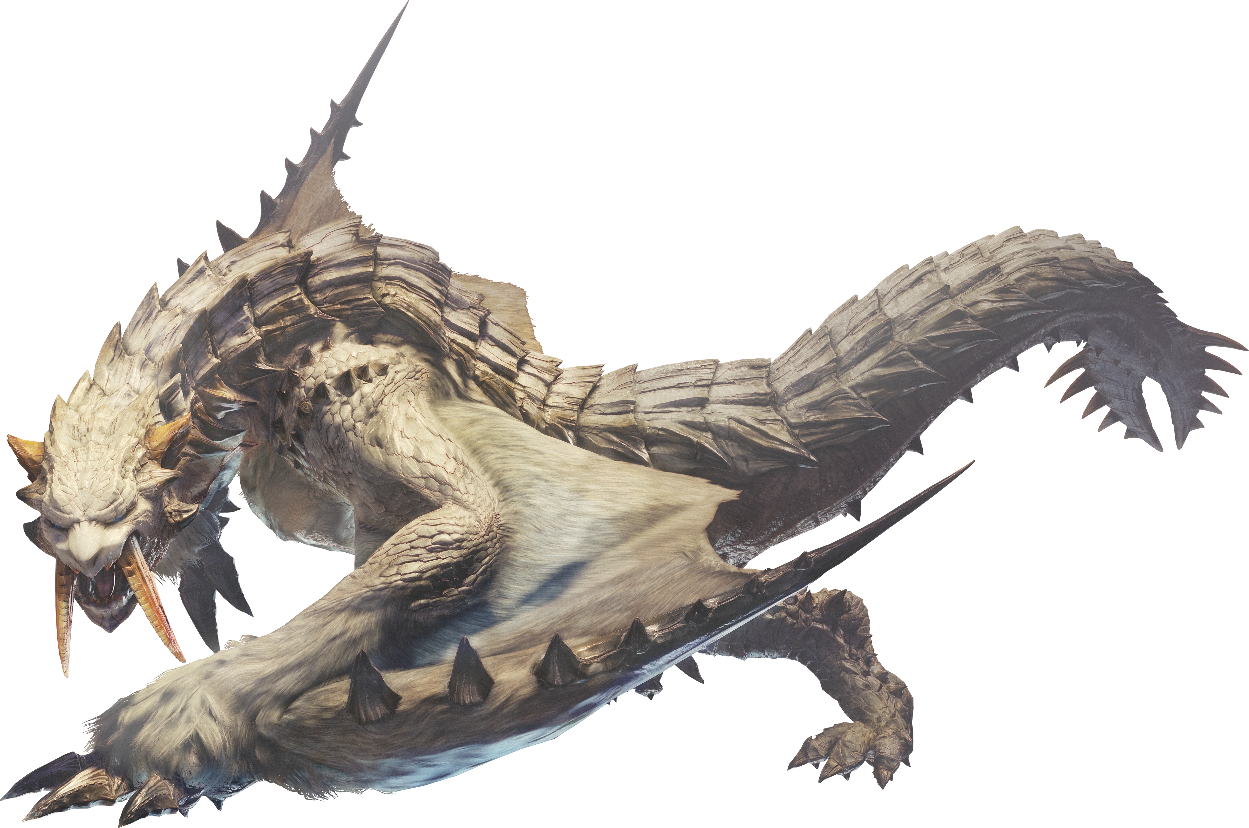
When I created I had in my mind to create a scaly dragon egg shape package I also experimented with different styles of packages like a medieval chest or a Vigorwasp from MH-link but I thought why don't use something that is related to dragons and that's what I did the shape is not so egg shaped but It works nonetheless. My product is suitable for children and young adults, the children because the egg shape will remind them of surprise eggs and for the adults just the pure nostalgia that they have from playing Monster Hunter.For the creation of my package I used Photoshop's 3-D tool , for starters I used an oval shape for my package shape after that I took my logo and put in the middle of the package with my company name above the logo and drew the line where the package is suppose to be opened from. For my skills I would improve my experience with the 3-D tool so I can create more complex structures and objects like video game characters or creatures this also will help me with Level 3 Games.If I had more time to work on my package I would have made it into an actual egg shape with a more scaly structure to it like importing a scale banner and put it over it but I'll rather not and made my own and also made the logo more appealing to the eye and a fantasy type writing. The problems I had with my package were the constant crashes Photoshop had an a lot of the model glitching and the logo being more pixelated that I wanted it to be but because of the crashes and the glitches I was satisfied with a simpler model that looks more like a ball to be honest and the logo is better than it was so I was happy with it.
Magazine Advert
For the project I also had to make a magazine advert, comparing it to professional magazine adverts such as Starbucks with the red background and the coffee foam that is shaped like a woodland pine is fine because my magazine advert has a professional feel to it and also the Christmas theme works perfectly with my product because of MH idea and the new DLC that has been released.
My magazine advert is suitable for children and young adults such as the fans of the games, for the children the snowman kitty and the white cat will attract them also the Santa hat will obviously draw their eyes to it, for the young adults or people that have experience with the series will feel nostalgic about the advert and will probably get more people to try the product and play the games.
My design appeals to children because of the use of objects that kids find cute or cool to look at and the use of white and snow reminds them of Christmas and Santa of course and for the fans of the series the Barioth-link , the Hoarfrost Reach-link and the Palico Winter Star Event armour-link will surely make them nostalgic of the old games and the latest one and will be attracted to my product. For the creation of the magazine advert I used Photoshop, for the start I used a background that best fits my idea and the products theme and placed it on a blank page after that I took my package and places it on the left down side of the image and sized it to fit the best , I took an image of a Barioth and placed only half the body into the background and resize it to fit the best I also took a Palico image and cropped out only the cat and placed him on the top of my package and for the finale I cropped an image of a Santa hat and put on the head of Barioth. If I could improve my magazine advert I would fill it with more monsters from the series and made my package bigger and have my brands name at the top. The most successful of my magazine advert is the Barioth that makes the image more lively and it fits perfectly and I'm happy that I choose him.I experienced with only this design because it fitted my idea the best but I had different ideas for monsters to put in the background but I ended up with a Barioth. I had not so many problems when creating my magazine advert the only major problem I had was the quality of the images that I had prepared for my magazine advert but I choose a high quality images because I resize the images by pressing SHIFT and C.
TV Advert
Me and my group created an advert that represents the Art & Design department of Stanmore College, comparing it too more professional TV Advert I can say for sure that ours is close to them in detail and the little details such as the faster part at the beginning and the small viewing of different projects. We program we used to turn the footage into a video was Premier Pro we had to sync the recording that we had with the footage we took it was indeed infuriating at times to sync it up and make a start and finish but after many failed attempts we finally got a version that fits the best and is satisfying enough for us at least. If we would have the time to redo it or start from scratch we would do more interviews and have more footage of the projects in there and get more students in the footage. The most successful part of our tv advert is the start with the speedup footage that gives me a movie start feeling and I adore it, the issues we had with the filming was the pacing and the background noises that weren't needed in the advert and the constant crashes Premier Pro had and that was a really big thorn in our back but we overcame it by recording and filming when the classes were quieter and did small parts at the part and stick them together so Premier Pro doesn't crash.
Radio Advert
To advertise my product I had to create a radio advert, compared to
professional radio adverts such as Spotify it sounds very bad but it fits my product well and the purpose it has been given for example the valentine KitKat one has a funny concept behind and very simplistic such as saying different pets names and saying at the finale to enjoy a KitKat and that works very well I also wanted mine to sound funny and you can hear some good acting in their ad. My radio is solely targeted to fans of the games such as young adults and adults because of the small reference that only individuals that played the games or heard about them will understand. For the creation of my radio advert I first recorded my voice and a female colleague of mine after that I put all of them into Premier Pro and edited them with a music background-link and different sound effects from the internet such as a tornado sound and a roar after picking every single sound I stick the VO and the sounds together to make it , I export it and put it on YouTube as unlisted. If I could improve my advert I would make it longer and put different music in the background that it symbolises what is said correctly and also get more VO that have a different role to full fill and have the roar be longer and more intimidating. The most successful part of it is the quality of the female VO and the effort that she put and other things that are successful is the blending of the music with the voices. About the experimentation that I did with it was not so much actually because I had a ground idea from the start and I went with it and it made it and it works so base on that I don't have so much to write about the only thing I can say is the voice takes we had most of it were for fun but for the radio advert nonetheless. The problems I had with the advert were the constant crashes with Premier Pro and the loss of some voice takes but other than that they weren't many problems, we overcame the problems by making it piece by piece and only extracting the voice bits that we needed.
Web Page
For the project I made a website to promote it per say and If could
compare it too sites like Off White or Supreme I could not compare it too Off White because of his simplistic but complex style with the video that was running in his background and the clothing models that they had but with Supreme I can compare it because of mine and their site is similar in having a white background and the simplistic style. About my target audience it matters who visits the site and look for the product that they want and if I can say what I was aiming for it was the calming feeling of nostalgia from fans. The website functionality works buttery smooth and the two pages link very well with each other and I wanted to give it a more realistic feel to it by adding a subscription option to my site and the layout is very simplistic with the only complex colour panel being the background-link the position of the logo and the size was made specifically so people and see it and approve or disagree also the size of the text wasn't chosen it was just the default of Dream Weaver. The thing that worked really well with my website was the layout that made my website not look chunky and dirty per say and made it look organised and clean. If I had more time to work on my website I would choose a street like writing and make the background of a reddish filter over it with the layout being white towards grey with some red veins on them and maybe a video playing the background and a song coming up as someone opened the site and also making links valid and putting a hoodie that I made in Photoshop as a clothing example. For the creation of my website I used Dreamweaver , I started by opening a blank website and putting a banner that fits the best I had a decision between the first one and the current after that I wrote my company name was the title of the site and of the page I added some descriptions and text to solidify my product, information , addresses etc. the the only tool I was using was the text tool so I can fill the site with information. For my skills I need to improve by knowing how to make a better layout for sites and to create my own background and choosing correct writing types. I experimented with it by choosing different background but the ext and colour stayed the same all around. The problems I had was with the crashes that Dream Weaver had , bad positioning of the banner and sometimes my work didn't save, I overcame this by creating the site in one go and changing the background that looked ugly on it.
ANIMATED LOGO
For my logo animation I choose for my site it was purely for having a simple animation all around and save time is not suitable with my logo but it does give a feel that is flying and there is no message sadly. For creating my animated logo I used Animate , for the first thing I used it was the different onion layers and the masks I dragged my logo around and stopped at every single mask. If I had more time to work on my animated logo I would have make it flap his wings and fly around in circles and made it breath fire once in a while. The most successful part of it is the movement because of the fluid movement it has I think so, the problems I had with making my animated was one and that was the masks placement that was because I forgotten how to do it and it took a chunk out of my time but I overcame it by asking for help and making the masks more closer to each other.
No comments:
Post a Comment